Wednesday, November 12, 2008

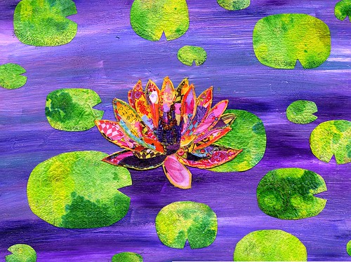
Water Lily


Honestly, I have been doing art! I just haven't really finished anything, therefore I haven't posted.

Right now I have 5 pieces I'm working on. Three are almost done. Why in the world I don't finish them I don't know, but I am close, so soon I should be bombarding the blog world with my latest creations.

This Water Lily piece however, I did manage to finish. It was a present for my mom's birthday, which is why it actually got done. ;)

I knew I wanted to make something handmade/artsy for her, but I just couldn't figure out what. You know all those artists out there who have a string of ideas running through their head and they can't create fast enough before new ideas pop in? Yeah that's not me.

Ideas do not flow freely for some reason. I think my brain is cluttered up with a lot of useless day to day worries, which blocks my creative juices. It's a crying shame, and someday I hope to be able to roto rooter around and find my muse, but until then, I have to take my chances with inspiration randomly striking. If it doesn't, I turn to magazines, other art blogs, books, etc. to find ideas.

This is what happened with my mom's present. As I was flipping through a craft magazine, I found an article on an artist, who created pictures with tiny bits of fabric. Hmmm.....That got me thinking. I have fabric. I like fabric. Fabric is pretty. I can make a fabric picture too!

I started out really ambitious. I was going to do most of the picture in fabric. I sketched out a scene with a lily pond, mountains, trees, and sky. I bought the canvas. I organized my supplies.

Then I went to the fabric store.

Oh the choices!! I was like Robin Williams in that movie Moscow on the Hudson where he passes out in the grocery store, because the choices of coffee to choose from is just too overwhelming. The fabric store was the same way.

I knew I wanted each item in the picture to be made up of different fabrics and colors of various hues. This meant the trees would have their own set of brown and green fabrics, water, blues and greens and so on.

45 minutes and a pile of fabric later, I realized it was too big of a task for an amateur like me. Not to mention expensive. I had to scale this down, especially if I wanted to finish it in the three days that I had.

So I nixed the mountain scene and went for a more Monet lily pond look. Though at the time, I honestly didn't intend to do that. Monet was a big influence on my early art, so I guess it just seeped through unconsciously.

This time only the flower was to made up of fabric. At first I wanted to do a bunch of different purple and pinks to make up the flower, but as I surveyed my options, I couldn't help but be drawn to brightly colored patterned prints. Pinks and purples never seemed to make into the cart. Ah well, I can't fight inspiration.

The background also changed throughout the flower creating process. The first background was painted with light and dark blues. It turned out really good. However, my original plan was to create something in my mom's favorite colors pinks and purples. Since I wasn't doing the flower in those colors anymore, I thought I better find a way to incorporate them into the background. So I painted over the blues with pinks for a more abstract water look. This turned out beautiful. However, as the flower became more and more evolved, I realized the background had to go.

The flower was completely lost in the sea of pink. At last I finally decided to go back to the original blue, but add some purples to it. The flower stood out a lot more this way, so I'm glad I changed it.

I also tried something new for the lily pads. They are actually dyed/painted paper towels. One thing I found out, is that paper towels are super durable! They certainly can stand a lot of liquid. I learned this tip from Tracy Bautista. Those paper towels you wipe your paintbrushes on? Are perfect for this! As is old paint water. That combination plus a few randomly placed drops of dye, created my lily pads.

The last bit of this picture I did was the middle of the flower. Although you can' t really tell, it is made up tiny beads and glitter. I love using beads, but I tell you, it sure is a challenge placing each one in the right place. Tweezers definitely come in handy! Plus it's super time consuming. Luckily I didn't need too many, so it went relatively fast.

I have to say the whole fabric thing was definitely an adventure. Honestly, I almost canned the project about 4 different times when I didn't think the flower was coming together right. As usual the art creating process taught me a valuable lesson.

Finish an idea to completion, because you really don't know how it will come out until it's done. I can't tell you how many times, I thought it was coming out all wrong, and the colors weren't right etc, only to finish the project, and see it turned out much much better than I imagined the original.

Hopefully some day I'll actually learn this lesson and not get so frustrated when things don't go exactly as planned. After all there are no mistakes in art. Right?

Or if there are they can at least be covered up!

Monday, October 20, 2008

Witchy Woman


My goodness, I've been terribly slow, getting the artwork done. Part of that is not entirely my fault. You see, my husband and I finally redid our studio downstairs.

Not only did it take a lot of time, but my workspace was in an uproar, and I was totally unable to get to my supplies.

But it was well worth it, because now we have a nice pretty yellow and hot pink studio vs. brown. Yeah. It really was brown, and not very inspiring for two creative souls like us.

Now that it's all finished, I had a little time this past week to play around.

I'm working on several paintings/collages right now, but Witchy Woman is the first one done.

I started and finished this last night. A record for me considering I started a haunted house about 6 months ago, and have yet to finish it.

Anyhoo, about the picture. First the background. You can't really tell in this photo, but the background looks like cobwebs.

This was one of those happy accidents, that sometimes happen when you play around with new techniques.

I started off by painting orange over everything. When that was dry, I took a sponge and dabbed/smeared black and white paint around. At first I was just going for a little bit of a texture look and totally thought I would be adding much more, either colors or collage elements, but when I stopped, and stood back, I saw that it had this really neat cobweb effect. Needless to say, I was really pleased.

From the beginning, I knew I would be making a painting of a witch. However, the original idea I had was a more whimsical character. I was intending to make her friendly and fun looking, but obviously that didn't happen. :)

I really had a lot of fun creating her. Painting for the most part is so much fun for me. I love to listen to my music and paint fast not really thinking too much about detail.

For most of the picture I could do that. The hair and face were big enough, but when it came time for the neck and hat. Ugh! I had to do shading in small spaces, and that is just not fun for me. I'm way to impatient. The use of small brushes irritates me. My husband on the other hand is the king of detail and can't understand my aversion to it. He will spend forever on one picture. Obviously that makes him the better artist, but that's okay, I like my method.

However, if it wasn't for him hounding me, the hat and neck wouldn't have any shading at all. I admit it looks waaaaaaaay better with the extra effort, but boy is it boring!

Now if only I could just get that Witchy Woman song out of my head...

Friday, October 3, 2008

Bird Lady


Well I certainly didn't intend to be away this long. For awhile I was popping out art projects left and right. Then this past week or two I've slowed down for some reason.

I have done some work, but right now it's stuff I don't want to show. A few pages in my journal, that really aren't for public viewing. At least not yet.

The cool thing about them though, was that I did them without regard for how it was going to look.

Not that I wanted them to turn out bad, but I just let my emotions, and intuition get carried away, and see what it produced.

It was a lot of fun, because there wasn't a long thought process regarding what collage element to place where. Is this color okay? Should I do this or that? Etc.

Those pages are also the only pages I have actually written on as a journal. Which is funny, because when I started this adventure, I fully expected to use the journal for writing in addition to art. Then the pages became more and more elaborate, and I didn't want to "mess" them up with my feelings of the day. Funny how things turn out.

Anyhoo, today's picture is from my Crowabout Collage Play challenge. Unfortunately I turned it in late, but that's because I pretty much did the whole thing today. Part procrastination, part life got in the way. It happens.

Let's see, to start with, I chose the background colors based on the dominant colors of the collage pieces, we received. Pink, yellow, and light blue.

The first ten pages of my journal have solid color backgrounds, that were done with acrylic paint. The last few pages I have been using those Neo II water soluble crayons. I just scribble whatever colors I'm using all over the pages, then brush it with water, which gives a watercolor appearance. Then I add acrylic paint in spots, and highlight it with shimmerery powder.

So far I really like the effect of these new backgrounds, they are more interesting and colorful. The bad thing is, sometimes I don't want to mess up the background by drawing or putting images over it. :)

The face of the bird lady was a collage piece I had to use, and I knew right away I wanted to make her the dominant feature of this page. I just so happened to have a cool fabric with huge flowers on it that I used for her "hat".

It's hard to see in the picture, but this page is pretty embellished. The earring is actually a real one from a craft store, that I gussied up with glitter and beads. The necklace part of a bracelet. The feathers in her hair, I've had for about a decade and never once used them, so I figured this was the perfect opportunity.

The gloved hand holding a flower is actually me. My husband took the picture in our garden, and I changed the flower color in Photoshop and made it small. To be perfectly honest it was his idea. After searching forever for a gloved left hand holding something delicate, he suggested we just do it ourselves. Duh! Why didn't I think of that? I might do this more often if I can, it sure would cut back on searching for images.

All that helped a lot, but something was still missing. Then I saw it, a blue thread with fringe. Perfect. I put that all the around like a frame, and it really finished it off. Especially since I didn't have my usual borders all around the page.

As usual, I totally did not like this page when I first started it this morning. Even after gluing the collage pieces down, it still didn't look right.

3 hours and many embellishments later, I think it finally blossomed into a nice piece. I really like it now, and I'm pretty happy with the way the bird lady turned out. Half Carmen Miranda, half bird.

If nothing else then at least the colors make it enjoyable right?

Tuesday, September 23, 2008

I'm painting again!


Well tonight, I don't know what got into me. I was supposed to be working on my challenges, but for some reason, I just couldn't get into it.

I was really feeling the need to create something on my own. No prompts, no themes, etc.

I had this canvas already painted in a wash of lavender, and the idea for this girl roughly drawn in pencil. It's been sitting on a window sill for over a month waiting for me to finish it.

On a total whim, I grabbed it, and just started painting. With my fingers! I've never done that before, and it was a wonderful feeling. I really wasn't concerned with how anything looked, I just kept painting.

By the time I got to her facial features, I was stumped. I had already done the lips, but eyes have always alluded me.

I toyed with the idea of not giving her any, but that made her look sort of creepy. And not in a good way. :)

Since I felt she probably needed them, I put a bit of hair over one eye, so I wouldn't have to worry so much about the eyes being even. :) Yes I'm lazy that way!

I have to admit, the face was the least favorite part for me. I was having so much fun being carefree and not following any particular rules, that when it came time to do the "detail", I really felt restricted.

I suppose I should either practice facial features so they come more naturally, or learn how to make them more believably "abstract". :)

Incidentially this girl is based on another that I drew in my art journal. Strange thing is I cannot seem to finish her page. Ugh.

Either way, this was a fun piece to work on, and I just may not pick up a brush again!

Friday, September 19, 2008

Flying Circus

This is for the 2nd challenge I'm doing with the Crowabout gang over on Flickr. Such a fun group. Every Saturday Nancy from Something to Crowabout gives us a collage sheet to download, and anyone who wants to participate has until the next Friday to submit their work to the groups Flickr page.

This is my second week, and I tell you I look forward to every Saturday morning to see what the next challenge will be.

This particular week's challenge was well, a challenge. :) When I recieved the collage page, I thought oh my gosh, what the heck am I going to do with this?

The sheet had two lady's torso's, a couple of Valentines cards, Dumbo, an old style plane, some foriegn money, a couple other sign looking items, the word play, and a little girl in a blue hat.

I thought long and hard, and tried a multiple of different ideas, and nothing really clicked. (Sound familar?) For some reason, I decided to flip around in my journal and see what I had left unfinished.

That was the ticket. I had partially made this page a few weeks ago. I had the big bird, and the circus tent in place, but that was it. I knew for certain I wanted a Flying Circus them. So I started cutting off heads from the collage sheet and sticking them on birds bodies.

Once I did that I knew I could make this work. Dumbo was one of my collage pieces and that was perfect too. The sign he is carrying originally said "Learn to Drive", obviously I had to change that to fly. :)

I really like how this page finally turned out. Surprising theme for me, as I actually don't like the circus, becasue of the clowns, but this page seems so fun and colorful.

I'm excited about the circus tent too, because it allowed me to use two different fabrics, I'd been wanting to try. Though I admit, once it came time to do the top of the tent, I was tired of trying to cut the fabric to the right size, so I took the lazy way out, and opted to use pen and glitter.

I actually think it's better, because not only did it allow me to use fun sparkly glitter, but it also gives it more texture and character I think. Then again, I'm no art critic so what do I know? :)

You know it's funny to me, how these pages are coming about. Most of the time, they are turning out completly different from what I intended. It always surprises me to see what shows up when it's finally finished.

Alot of the end product is actually a result of numerous trials and errors/mistakes that I made. Weird how art works that way. Because I always seem to like the final product, mistakes and all even better than I did before.

Wednesday, September 17, 2008

Flower Queen


Well it's been a few days since I posted, but that's because I've been busy doing all these wonderfully fun art challenges, I just found out about.

I'm doing three this week, and this Flower Queen picture is the first one to be completed.

I made it for the Inspire Me Thursday challenge. The theme this week was yellow.

I really had fun with this. First of all, I love yellow, because it brightens up everything. Right away I knew I had to use the yellow body. I've been dying to use it in something as it was such a cool picture and this was the perfect opportunity. You may not be able to tell, but the body, is made out of little glass looking squares which I thought were really cool.

Originally I was going to use the head it came with and give it funky facial features, but that idea was canned, when I messed up her red flower hat I was going to use as well. Note to self: Do not glue collage pieces down until absolutely sure!! Unfortunately I glued the flower down right away, when I should have cut it properly and put it over the head for a hat. Oh well live and learn.

Turned out better anyway I think, as I found the Marilyn face lying around that just happened match.

This is the first time I've done a double page, and I really like it. The other thing I did differently was trying a new background technique. Usually I just slop watered down acrylic over the page.

But this time, inspired by a Suzi Blu video I saw, I put down a layer of gesso, then used my Neo 2 crayons to scribble over the pages. I brushed water over them in some places and smeared some yellow and white acrylic paint over it too. I then found some cool powdery stuff (don't know what it was) left over from my stamping days and sprinkled that over the pages as well.

I'm really pleased with the effect. While not as bright as I originally wanted, it definitely gives the pages a more textured look that is more interesting to the eye I think.

One more final note about this page is that I used a lot of embellishments, which I really think make it shine. The necklace was my husband's idea, and I'm so glad he suggested it, cause it's one of my favorite elements. I made that out of the extra beads I have lying around. Finally I'm using them!

I'm really surprised once again, how the pages come together to form a picture. When I first stared, I just had the yellow body and an idea for a flower hat. I spent ages, trying to find the perfect borders and collage pieces, (something I really must learn not to do) and nothing worked.

I finally gave up and put it away for the night. I find this is the best thing to do when you are frustrated with a project. Put it away and look at later. Half the time I come back and find what I had really wasn't so bad after all. The other half, I find I come back to the project with fresh ideas, which is what happened with this piece.

Once I put the mushroom with the rabbit in there, the idea for a garden came about, then a new idea for a flower "hat", and presto the Flower Queen was born!

Thursday, September 11, 2008

Life is a Canvas


I almost don't have words for this. I can't decide if I like it or not. For some reason it's my husband's favorite piece so far, but I'm still trying to warm up to it.

Some aspects I really like. I like the house a lot. I really personalized it by coloring it and adding flowers etc. The hat is my favorite. :) Overall I think it came out pretty cute.

I also like the "It's a Small World- esque" doll/lady. I saw the dress in a magazine and knew I had to cut it out and use it somehow. Of course I cut off the original head, and added my own as it just seemed to fit the theme better.

I think the main problem I have with it, is all the primary colors. Reminds me of preschool. I never did like that look for some reason.

I was kind of spoilt for choice though, because I already had the dark blue background, and that was the only one I had ready that the red dress worked on. I guess I was a little impatient. :)

I'm a very color oriented person, but my colors tend to gravitate more towards pinks, oranges, reds, yellows and purples. I guess the blue threw me off. I probably will not do another background in that color. Next time I'll go for baby blue or turquoise instead.

Overlooking the color issue, the page is fun. The dolls and the house remind me of Disneyland, and I like how it's so busy. That is the main reason I chose to use the Danny Kaye quote even though it didn't really fit.

Somehow the words, "Life is A Great Big Canvas, Throw All The Paint on it You Can", just seemed so appropriate for this page don't ya think?

Tuesday, September 9, 2008

Look what the cat dragged in...

So this is the first journal page I ever did. Funny thing was, it totally morphed into something completely different than what I originally had.

Originally the head came with a body, that had a hint of red in the clothing. I kept thinking I had to keep it, to tie it into the background.

It drove me crazy for about a week, because no matter what I did, nothing really worked out.

The body seemed out of place, the borders and other collage materials I chose didn't mesh, etc. Eventually, I got so frustrated, I ended up working on other pages instead.

Flipping past this page every night, was a constant reminder of the mess I left unfinished.

Finally, I decided to do something with this monster. So I ripped the body off, and drew the elongated neck with stripes. As soon as I did that, I felt an immediate relief. Why didn't I think of that sooner!?

Anyway, the skirt was already there, so I added a little torso to fit it.

As I was fooling around with borders I came across butterfly wings, and thought, hmmm... these wings look good, in fact the body looks like an insect body...

Before I knew it, this picture appeared. It was a very interesting process for me, because until I got rid of the offending body part (hey that doesn't sound right), I felt I could do nothing to make this picture any good.

I was ready to rip it out of my journal and tear it up. It's amazing what one little change can do. Now it's one of my favorites. I really like the zetti-ness of it. (Yes I admit, I am totally inspired by Zettiology, and Teesha Moore. I just love her stuff!!!)

Anyhoo, this page has definitely taught me a lesson in art. If something isn't working out, don't give up, because there is always a another option to make it so much better.

Monday, September 8, 2008

Check this out...


Alrighty, just like I promised I'm starting the process of uploading my pictures. Here's a piece I finished last night for the Flickr group Collage Play with Crowabout run by Nancy Baumiller, check out her really awesome site here.

I love doing collage, but I'm so new at this whole art journal stuff, and am not used to working with such thin paper!

Right now, I'm doing all my work in a 9x12 Canson spiral bound notebook. I've been gessoing the pages, then putting a wash of acrylic down for the background. At this point I think the acrylic is too thick, as I'm having trouble getting the water soluable crayons and pencils to show up as vibrant as I want. I think I might try using even more water next time.

I know some people use watercolor, but with the book I'm using I'm not sure how the pages will hold up. I really think next time I will try watercolor paper, then bound the pages into a book on my own. Way more hassle, I know, but might be worth it. That is, if I can figure out how to do it!

For now though, this will work as I'm still in the "practicing stage". :) Next journal will be "real" art...

We'll see how this goes

Hey all, bear with me please. I'm totally experimenting with this blog and my art. :) I don't have many pieces right now, but in time I'm sure that will change!

I'm creating this blog with the intention to show pieces from my art journal, which I just started this past week. (so be nice please, I'm a newbie) :)

I'm also doing collage on canvas, but don't have anything finished to show. Hmmm...maybe I'll show works in progress too...

Anyway, right now things are a bit under construction while I figure out what to upload and show off!

Wish me luck!!